We are excited to introduce the launch of the Short.cm newly designed website! Our goal is to provide our visitors with a simple way to discover more about the product and the solutions we can offer.
We created a user-friendly browsing experience for our customers. The website is also fully responsive with mobile devices, making it easy to navigate on a wide range of web browsers and portable devices. The uncluttered design is easy to surf and use.
Short.cm team completely changed the color of the website. Now it contains a fresh and modern color palette that helps to absorb the information easily. All pages introduce the new illustrations, rounded shapes and tabs, as well as updated icons.
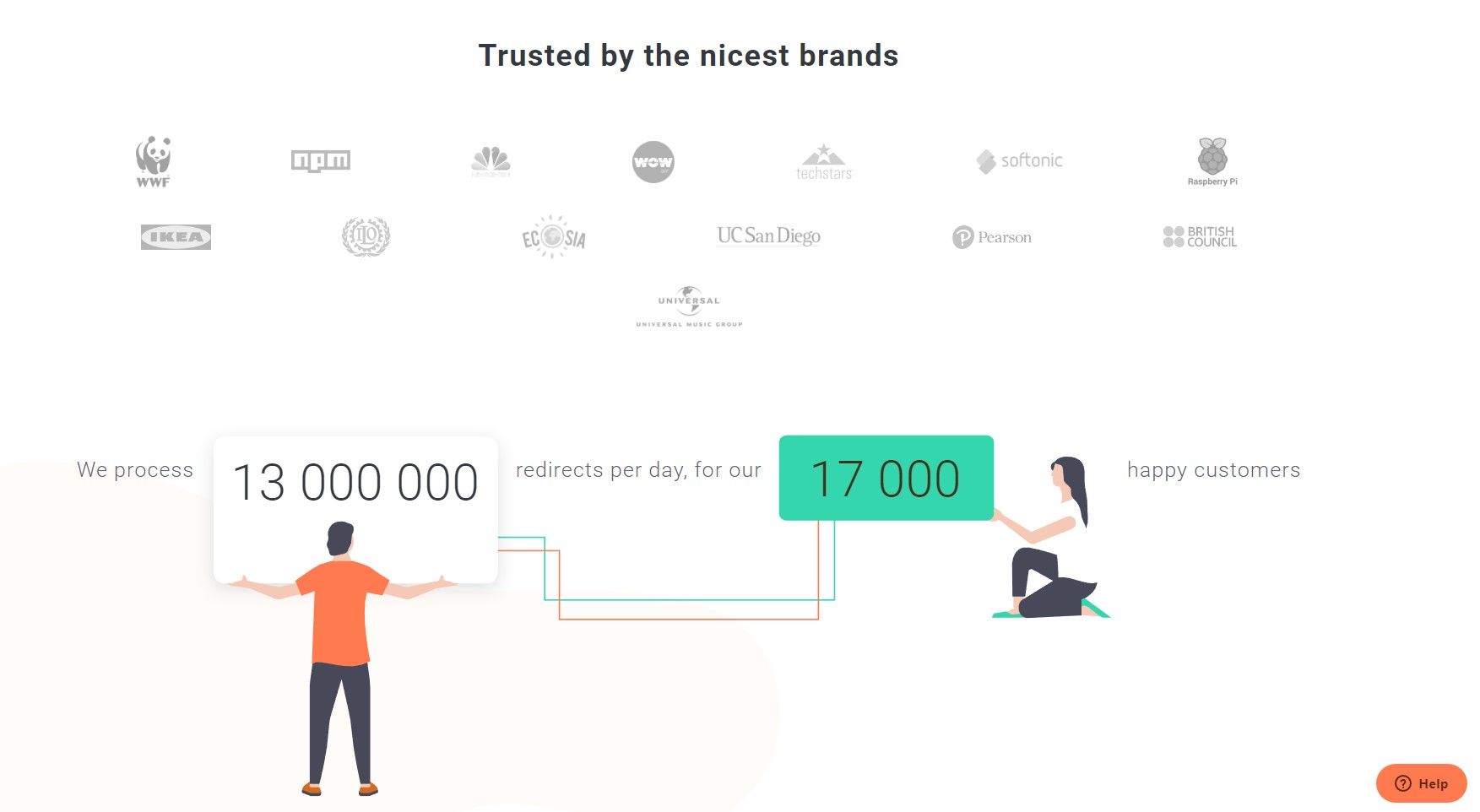
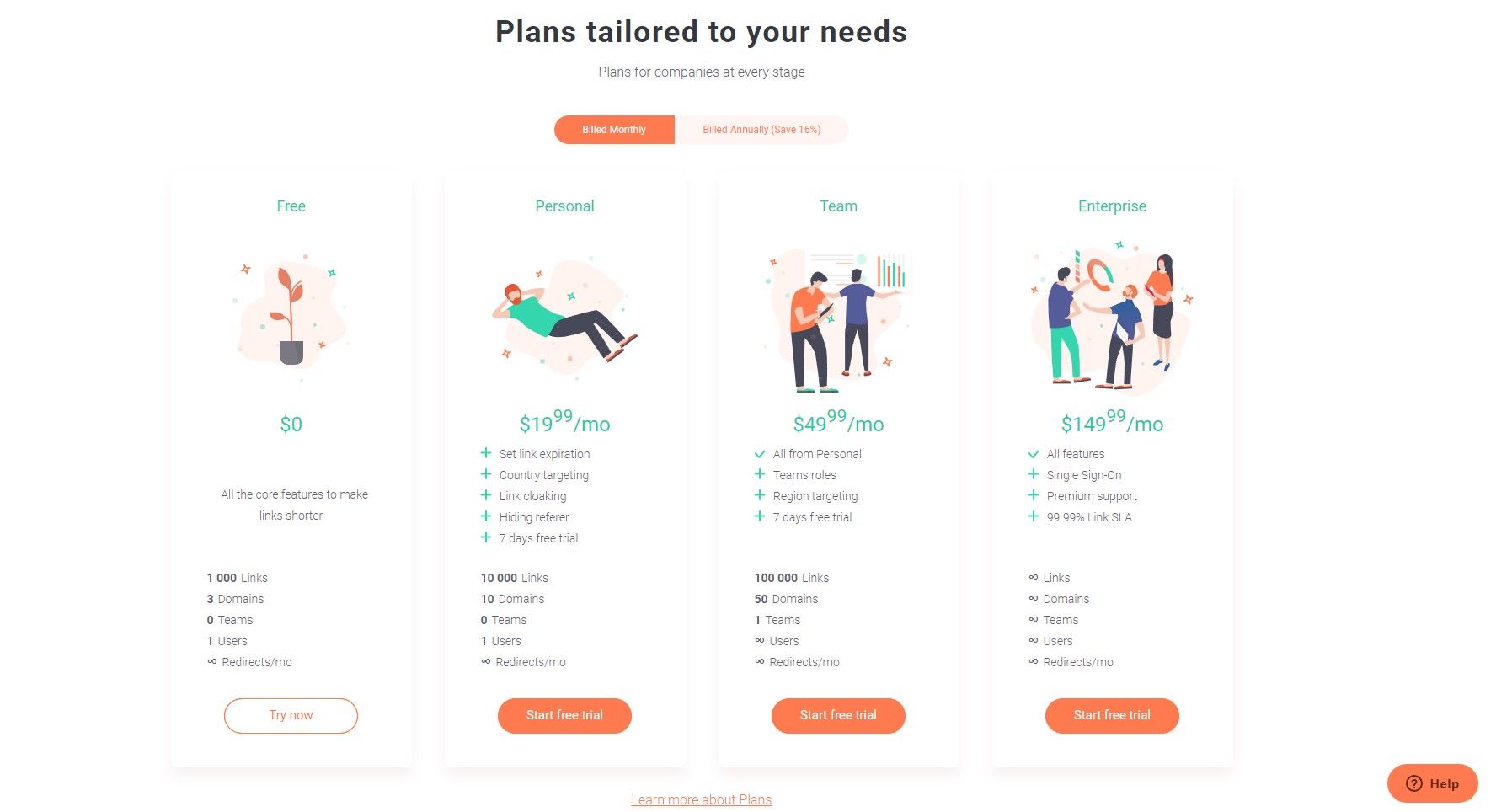
Main Page
Now the landing page includes big, beautiful and project imagery accompanied by vivid descriptions.
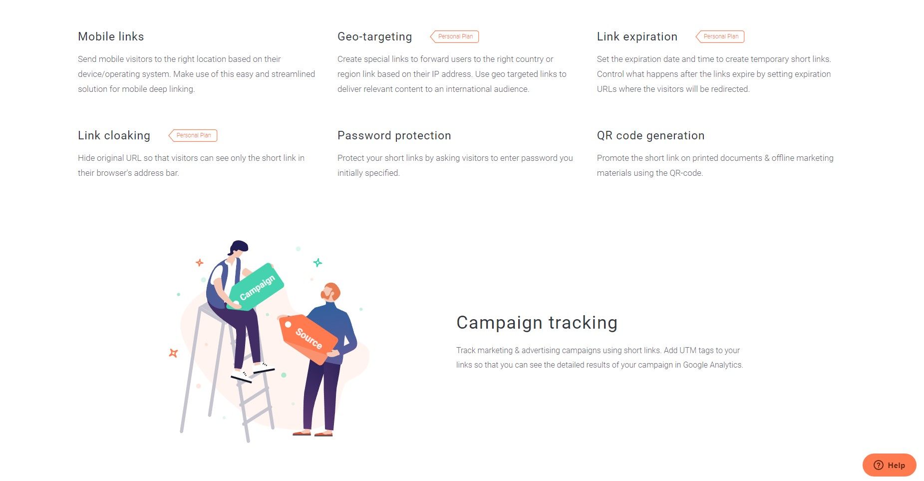
Features
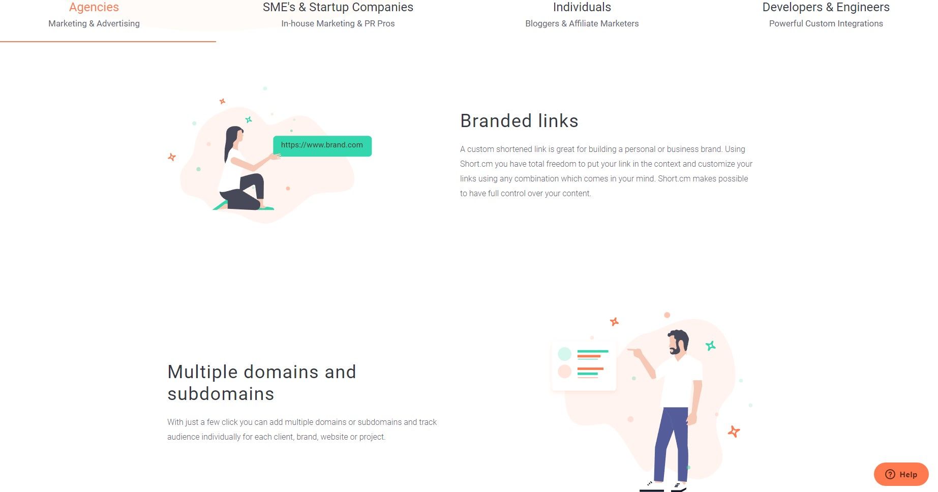
There is a list of features in this sector you may run on Short.cm. The page includes an easily readable, clean font, contrasting colors, and bright graphics.
Click a favorite feature and learn more about it.
Integrations
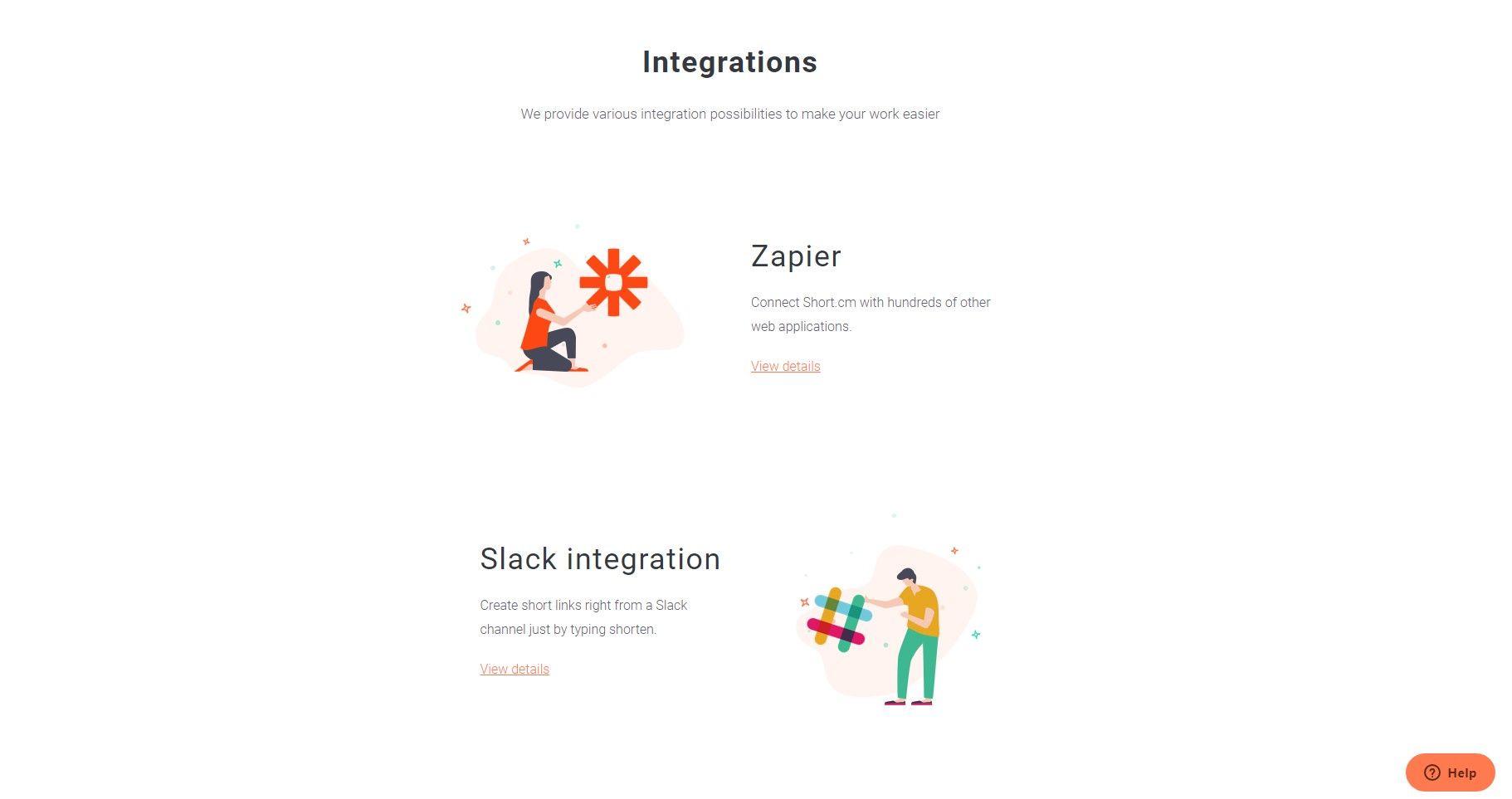
We added some new apps to the list of integrations. Now the "Integrations" page introduces bright graphic, the description to each app and the “View details” button that redirects to the support page. There you may follow the instruction to configure the integration.
There’s a whole host of changes and impactful advancements, all of which make the new site that much better.
The article is about:
- Say hello to the new Short.cm website design.
- Introducing the new design of the Short.cm website.
- Short.cm made a new web-design.


Join the conversation